RENTLYDuration: Aug - Dec 2024
Role: Designer
Focus: Mobile App Development + Design, Interaction Design, User Research
Group Members: Grace Liao, Tishyaa Chaudhry, Sara Riyad
Tools: Figma, XCode + Swift, Github, Adobe AfterEffects
In the Mobile Application Design & Development course, my team designed and developed an iOS app that connects college students through an aesthetic, user-friendly platform for renting clothes and following peers.
Background
rently is a clothing rental app designed to connect college students through a shared love for fashion. The app allows users to create profiles, list clothing items for rent, and browse or rent items from their peers. With its aesthetic and user-friendly interface, rently also offers personalized recommendations based on browsing and rental history, helping users find styles they love. Additionally, users can follow peers to stay updated on new listings, fostering a sense of community.
This iOS app was developed over the course of my Fall 2024 semester using Swift and Firebase. Since its creation, we’ve continued refining the app, focusing on enhancing its recommendation algorithm and preparing it for broader deployment.
Links:
In our ideation phase, we started brainstorming by thinking about what trends were currently circulating amongst people in 2024. We came up with these keywords / categories we wanted to delve deeper into:
community
wellness
connection
43 out of 58
people are interested in renting
This is a majority, demonstrating that there is a strong market interest in the core feature of the app, clothing rental.
slow fashion
health
exercise
Some of our app’s primary competitors are listed on the right. Similar to those apps, we are appealing to users who prioritize environmental sustainability and community interaction. However, Depop / Poshmark / Mercari are for buying and selling, not for renting. Rental apps like Rent the Runway and Nuuly have monthly subscription prices and contain items that are higher-end.
With local pickup, we are focusing on the college students’ niche. This niche has a lot of space for exploration; college students often need a formal dress for a single occasion, or a business casual outfit for a last-minute interview, or maybe even a winter coat because they’re from a warmer area. rently is affordable, pricing per day, and builds community within campuses.
social media
accountability
cooking
To choose a single idea, we each wrote down our ideas and voted on Google Docs. We ended up with an idea that represented the bolded words above. This idea was a clothing rental app similar to platforms like Depop or Facebook Marketplace.
Research
Because there were finer details that we had to hash out, such as pickup / shipping, payment, recommendation algorithms, etc., we created a Google Forms survey to gauge interest in the app idea and learn the preferences, needs, and behaviors of users. We received 58 responses, and these were our key insights:
Ideation + Discovery
The Idea
43 out of 58
people are willing to rent out their own clothes
While there is a market for renters, there is also a solid potential supply of clothing, which is essential for the app’s ecosystem and lifespan.
92%
are comfortable renting to friends or friends of friends
59%
are comfortable renting to people located near them
Respondents were much more comfortable renting to people they know or are near; not many were comfortable renting to strangers.
Based on these results, we made a key change to our idea: rently is targeted towards college students, facilitating renting within the campus or wider area with other universities. Many respondents were worried about shipping their clothes because the condition might not be ensured on return. By keeping the renting within a certain area, we can use local pickup and dropoff for the whole app, removing the shipping option.
Respondents also highly valued features such as user reviews and ratings. These preferences guided our feature prioritization for later development.
rently offers college students an affordable way to expand their closets through local rentals, fostering convenience and campus connections.
Early Designs
Low-Fidelity Wireframes
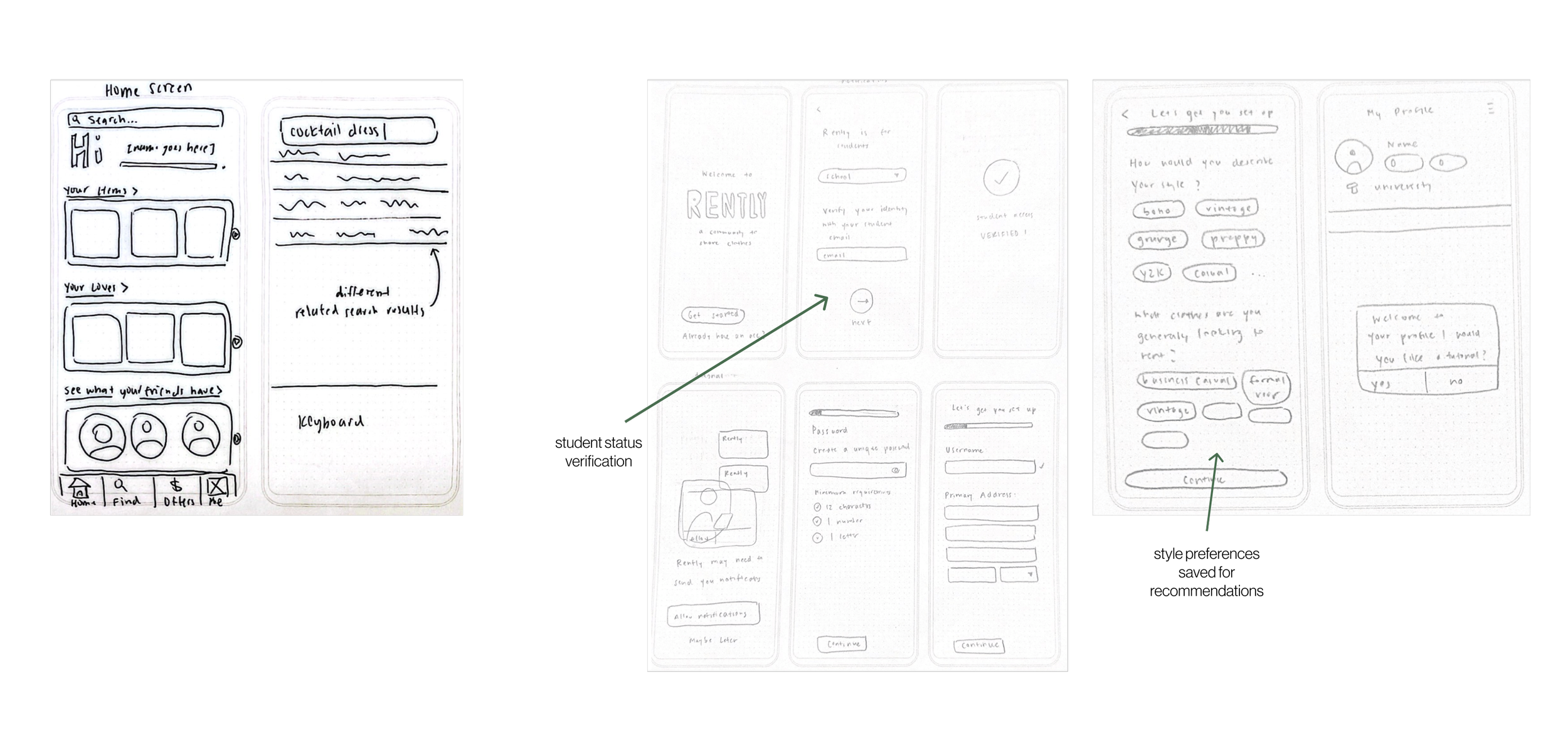
We sketched our low-fidelity wireframes, starting with quick sketches and then refining. We chose to focus on the onboarding process, homepage, user profiles, and what the rental process would look like. We settled on an architecture of four tabs— home, search, making a listing, and profile. On the homepage, users can view their items and likes, and search. During onboarding, users must verify their student status in the sign-up process to make sure it’s an authentic college community, and select styles and events to guide their homepage recommendations. We considered our users’ mental models, and based our designs on popular shopping and platforms for this age demographic— Depop, Bumble, and Instagram particularly.
Homepage + Search
Onboarding
Likes
Profile
Renting
Making a Listing
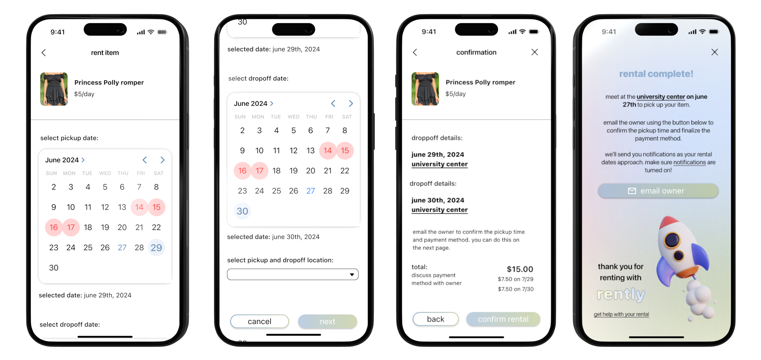
The rental process was initially challenging due to complexities anticipated during development. We started with a messaging-based approach, similar to Facebook Marketplace, where users could coordinate payment and pickup/drop-off themselves. However, developing messaging APIs proved difficult and time-intensive. In our low-fidelity wireframes, we explored an alternative where renters could send requests to owners, but we continued testing and evaluating other methods before finalizing a solution.
User Testing
We conducted several semi-structured interviews to gauge the usability of our designs. Having prototyped the low-fidelity wireframes above, we had each user go through the flow of onboarding, creating a listing, renting, and navigating to the various pages. Below are our primary findings, which directly led to actionable changes in the design.
“why are student emails required? what if i want to go back?”
We realized we lacked communication in our onboarding process, requesting users’ information without any explanation. Additionally, for some parts of the onboarding process, there were back buttons missing, which we added for more navigational flexibility.
“it would be nice to see the price on the listing before opening it.”
One of our users came up with the great idea of having the price of the item on the image so there wouldn’t have to be extraneous clicks to view the price.
“what if i wanted to search by category?”
Inspired by popular secondhand shopping platforms, we added a ‘search by category’ section above recommended searches, matching our search page with users’ mental models.
Design System
Palette
One of the main values of our app is sustainability, so we wanted a color palette to emulate that. Shades of green are often associated with eco-friendly products, so we knew we wanted to include that. We thought these colors were easy to digest and harmonious.
Primary
Secondary
Gradient
Typography
We decided to use Apple's default typeface SF Pro Display because it felt clean and balanced out our other designs and colors.
Graphics
We used 3D animation graphics from Kubikel Studio. They added a fun, modern look to our interface which is what we were looking for.
Final Designs
High-Fidelity Wireframes
Onboarding the app as a new user
Homepage
Search page
Making a listing
Profile
Checking on rentals
Renting an item
Reporting a listing
Development
My role in development was all the listing flows— making a listing, what a posted listing looked like, and reporting/deleting/editing it. In addition, because I designed the app and was the most familiar with the design, I was in charge of the formatting and UI of every screen.
Our deliverables included a presentation to our class’s Capital One sponsors, a promotional poster that I designed, and a promotional video that I also edited in Adobe After Effects.
Reflection
This project was one of the most rewarding experiences of my time in school. It’s rare to have such a significant role in both design and development, making this opportunity especially meaningful. Throughout the semester, we not only worked on this project but also learned Swift and Firebase simultaneously. Mobile application development was entirely new to me, so I relied on class instruction, documentation, and online resources to learn as I went.
On the design side, I used the iOS 18 Kit to ensure consistency in design patterns and UI elements within SwiftUI. Since my team had limited experience in design and human-computer interaction, it was a learning process for all of us as we navigated the challenges of designing and developing simultaneously. At times, we had to adjust our designs due to implementation complexities. This experience reinforced the importance of balancing ambition with feasibility. Initially, our scope was too broad, and as development progressed, we found ourselves struggling to keep up with the workload. If I were to do it again, I would focus on defining essential features from the start instead of aiming too high, ensuring a more manageable and efficient development process.
This experience not only strengthened my technical skills in Swift and mobile development but also deepened my understanding of collaborative design processes and the importance of scope management. It taught me how to balance ambition with feasibility, communicate effectively with a multidisciplinary team, and adapt designs based on development constraints. Moving forward, I’ll carry these lessons into future projects, ensuring that both the design and development phases are more intentional and scalable. This project reinforced my passion for building intuitive, user-friendly applications, and mobile app development is something I’m excited to explore more in the future..


